


“You never get a second chance to make a first impression.”
The same goes for your learning app.
When a user opens it, the design is the first thing they notice. And let’s be honest—if it’s terrible, the odds are they will close your application and never come back.
Spoiled by the abundance of educational apps available on the market, users won’t tolerate a bad user experience. If your software looks outdated, has a messy UI, or is simply inconvenient to use, they will go to a competitor without giving it a second thought.
In our article on education platform development, we mentioned that the e-Learning industry is expected to hit the $325 billion mark by 2025. That means the competition will only get fiercer. In order to prosper in such a competitive market, you should make a quality education app design your top priority.
As an educational software development company that cares about our customers’ success, we want to take a closer look at this topic and suggest industry best practices to follow when designing educational apps. In the following paragraphs, we mention the crucial factors you should consider to create a quality design that addresses the needs of your target audience and delivers the best user experience.
What is good design?
Before we start, let’s make sure we’re on the same page.
Design is not only about visuals—there is much more to it. When we talk about educational app design, we imply not only the app’s appearance but also its performance, the user experience it provides, the features it supports, its optimization, and more. Thus, to make your learning app competitive, it is not enough to create appealing visuals; you need to take care of other aspects as well.
So what is good design?
We believe good e-Learning app design:
- Adapts to various screen resolutions and operating systems.
- Is aesthetically appealing.
- Considers the age and abilities of the app’s target users.
- Has straightforward navigation without superfluous elements.
- Loads fast on any device and doesn’t require too many resources.
- Is unobtrusive (without ads or pop-ups that cover a big portion of the screen, distracting users from the learning process).
- Is innovative.
- Has gamification elements.
- Is easy to use for both teachers and students.
- Resonates with your target audience.
- Addresses the needs and pain points of the app’s users.
No matter whether you want to build a web app or a mobile application, keep this in mind when creating its design.

Education app design best practices: 7 things to consider
Now that we’ve made sure we’re on the same page, let’s talk about best design practices for e-Learning app development.
#1 Consider the age and abilities of your target audience
You can’t design a quality learning app without knowing your audience. That’s why we always recommend starting educational app development with the project discovery phase. At this stage, you analyze the market and define your audience persona to fine-tune your application and address the needs of your target users.
Once the necessary data is collected, the first step you should take is to consider the age and abilities of your future audience. Depending on the age group you target, the design approach will differ.
Designing for kids
Modern kids are glued to their smartphones and tablets. To make their children’s screen time worthwhile, parents often install educational apps.
What makes e-learning apps for kids different from those for adults?
The most prominent distinctive feature of such solutions is obviously appearance. Apps for kids use bright colors, lots of cartoon characters, and plenty of animations to keep little users engaged. Using them feels like watching a cartoon, which facilitates the learning process and motivates children to learn.
Another difference is navigation. Online learning apps for children rely on simple navigation with clear icons and avoid text-only buttons since kids under the age of 6 typically can’t read. The gestures in such applications are simple (draw, swipe, and drag). Given that kids have limited motor skills, it’s good practice to avoid complex gestures such as multi-finger, double-tap, pinch gestures, and multi-gestures.
Unlike adults, kids expect feedback after every action. Thus, a learning app for kids should utilize sounds, visuals, and text to respond whenever the child takes a certain action. More importantly, it should offer visual hints to guide the little user and help them find the right answer.
For more actionable tips on how to design educational mobile apps for kids, please refer to this Google Developers article.

Designing for adults
Obviously, the adult audience doesn’t need colorful cartoon characters or lots of animations to enjoy learning materials and online courses. What they need is a simple and minimalistic design without too many elements. The color palette, for example, should be restrained. Keep your color combination simple so that it isn’t overwhelming to the eye and doesn’t distract from learning.
Most adults are familiar with navigation buttons so there is no need to label those with text—use the screen space for something else. As for the navigation, this audience knows complex gestures well, so feel free to utilize them. The crucial part is to make your UI/UX design as intuitive as possible: the user should be able to use your app right after they open it, preferably without watching tutorial videos.
Also, adults love progress charts and achievement badges, so make sure to design those. Consider making share buttons for them so that the users can show off their achievements on social media and thereby help you promote your application.
Note that many adults have children and busy lives, so they often don’t have too much time to learn. To address this, we suggest implementing microlearning. Microlearning is when you break a complex topic into small chunks of information that can be digested quickly and easily. That will make the learning process much simpler and help you retain even the busiest users. We’ll come back to this topic later in the article.
#2 Make your learning app convenient for teachers
Due to the COVID-19 pandemic, many educational institutions and organizations have been closing their doors and switching to remote education. Some have invested in custom learning management systems, learning platforms, and other solutions to continue spreading knowledge. As a result, teachers all around the globe now face the necessity to embrace the learning approaches and technologies to which many are unaccustomed.
Lots of educators, especially those of older age, are used to traditional learning attributes such as blackboards, classbooks, printed textbooks, and so on. And when they open an app that doesn’t have familiar instruments, they get frustrated, not knowing how to use it.
Thus, if you’re planning to target teachers and educators that use conservative education methods, we advise you to implement the concepts and logic that are familiar to them in your educational app design. In other words, make your app’s interface and features similar to what such an audience is used to.
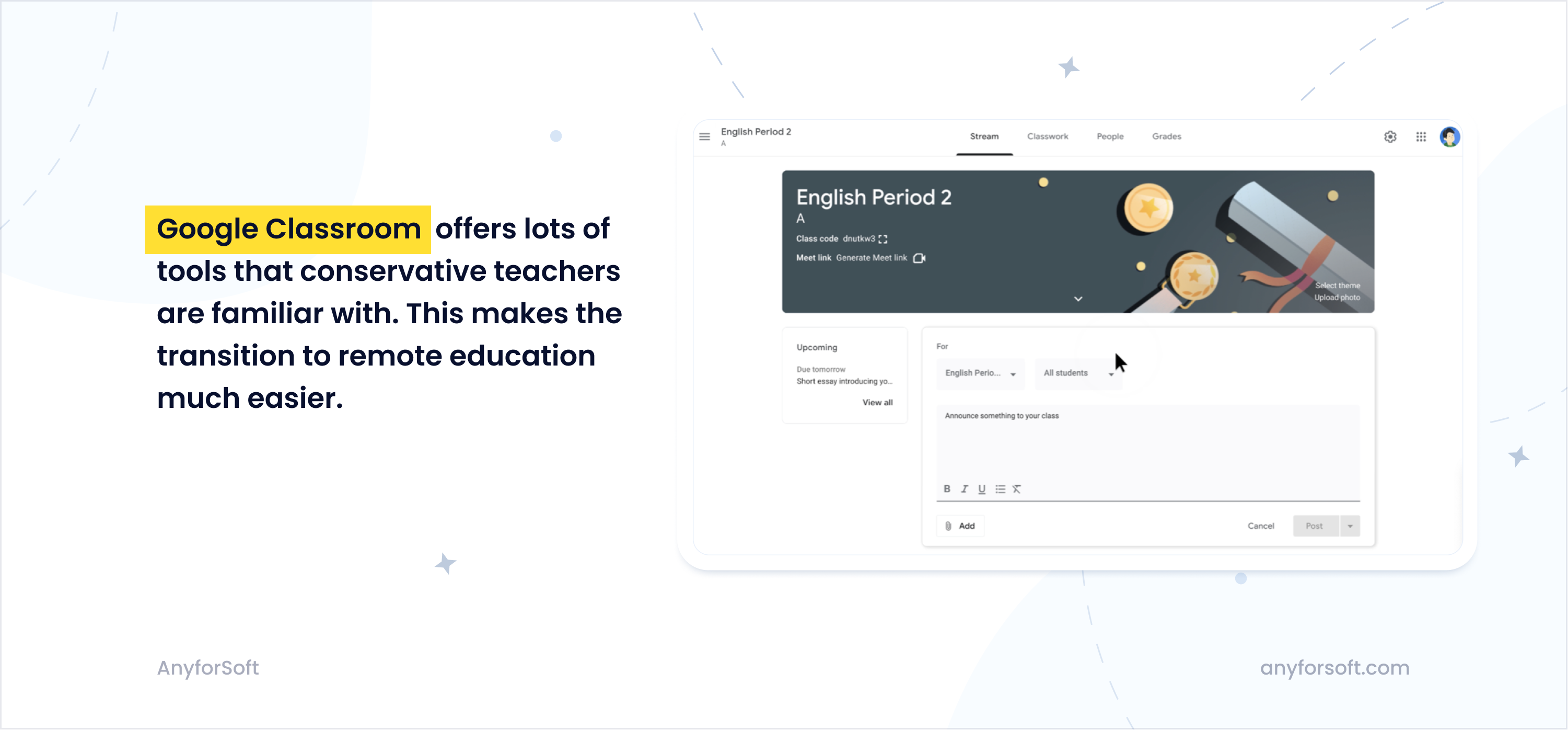
A great example of an app that is loved by teachers all over the world is Google Classroom. This application has many attributes familiar to conservative educators, including classbooks, homework, gradebooks, coursework, and so on. Given that Google Classroom provides lots of traditional learning instruments that teachers already understand, it makes the transition to remote education with its new approaches and technologies much smoother.
#3 Add progress indicators
Another feature of a well-designed learning app is progress indicators. Your application should give users an idea of how far they’ve come in their educational journey. That’s very crucial in a psychological sense: when a learner can see what progress they’ve achieved, they’re less likely to lose motivation and abandon their education.
Conversely, when the progress is unclear and there is no sense of achievement, the learner may lose motivation and stop using your application.
That’s why we strongly recommend designing various progress indicators. Let your users know:
- What progress they’ve made (for example, what percentage of the course is completed).
- How many course materials are still there to study.
- How many wrong and right answers they get on tests.
- How much time they’ve spent in the app, and so on.
You can also complement progress indicators with achievement badges. As mentioned above, people love them. For example, many EdTech apps offer streak badges (e.g., when a user studies for 30 days in a row, they receive a 30-day streak badge). By implementing achievement badges, you can encourage people to study harder and spend more time in your application.
#4 Design with gamification in mind
One of the most common challenges in the education industry is to keep learners engaged. When it comes to traditional learning (no matter online or offline), people often associate it with boredom and hard work. Frankly, no one likes to spend hours reading some boring textbook or cramming a list of irregular verbs in a foreign language.
By creating an education app design with gamification in mind, you will help your users learn new information more effectively. Research reveals that people who study with gamification elements perform better on tests than those studying in a more conservative manner.
Gamification in learning apps is a huge topic with its own intricacies. To learn more about gamification design, you can check out this article.
#5 Implement microlearning activities in education mobile app design
Traditional education doesn’t fit into the reality of modern adults. The majority of them have jobs, hobbies, chores, and other activities that take up most of their time. As a consequence, they typically don’t use apps that require them to study at predetermined times and diligently follow a specified curriculum.
When adults use mobile devices for educational purposes, they usually study in short bursts and do it on the go—while taking breakfast, waiting for their kids in a kindergarten, being stuck in traffic, and so on. In other words, they study between other activities.
To make your app of value to busy adults, you should implement microlearning. As mentioned above, microlearning implies breaking a complex subject into small and easily digestible chunks.
A study in the Journal of Applied Psychology reveals that microlearning is 17% more efficient than learning in a traditional classroom setting. Microlearning allows users to choose their own time for education and study at the most comfortable pace, without having to follow any schedules. That’s what makes it so attractive.
That’s why we suggest adding small educational videos, enabling flashcard learning (as in the above-mentioned Quizlet), adding mini quizzes, and other small activities. It doesn’t mean that you have to give up more complex and lengthy courses—if you have those, you can combine them with microlearning. That way, you will be able to target a wider audience.
#6 Make your app accessible to older audiences
People of old age also enjoy learning new things. Besides, there are plenty of older teachers who may use your application. Considering this, we think you should take care of mobile app accessibility and make your solution accessible to people over 50.
As people age, they face certain physiological, physical, and cognitive changes that impact their learning abilities. You have to understand these changes to create an effective education app UI design tailored to the needs of older adults.
The first and most common change is vision impairment. Older people don’t see things as acutely and clearly as young adults, and your learning app should reflect that.
Here are some tips to make your solution accessible to people with poor eyesight:
- Keep your text and button size large. Scale every interactive element so that it can be easily recognizable and clicked/tapped on.
- Use fonts with a minimum size of 16 px (also, it’s a good idea to enable users to change the font size in the settings).
- Take into account that color vision can deteriorate as people get older and use higher contrast to ensure that your learning platform doesn’t look bleak to older audiences.
Another common problem among people of older age is hearing issues. So if your application features video and audio content, make sure to complement it with subtitles.
One more thing to keep in mind is that many older adults are not tech-savvy. For example, they may not know what the full-screen icon means. Thus, label every icon with text to make your software intuitive. In addition to that, don’t make gestures too complicated—many older adults are not used to touchscreen technology.
#7 Adopt your competitors’ best practices
When it comes to educational app development and design, your competitors are a goldmine of useful information.
Don’t know what features to design? Having no idea what color palette to use in your application? Or perhaps, you’re wondering how to best organize your learning materials?
The answer is simple: go to your competitors, learn from them, and adopt their best practices. As mentioned in the introduction part, the eLearning market is huge, so we’d wager that it already has apps similar to the one you’re planning to develop.
Why reinvent the wheel then?
Browse your competitors’ applications and see what they’re doing. The goal here is not only to adopt your competitors’ best strategies but find their weak points and gaps. In other words, you have to find something that their app is missing and introduce the missing part to your software solution. This way, you will give your application a significant competitive advantage.
To find what a certain app is missing, you can simply read reviews about it. Go to the marketplace where the app is stored, find reviews, filter them by 1 star (or by “negative”), and pay attention to what users complain about. Make sure to avoid the same mistakes when designing your own app.
AnyforSoft’s expertise
Education app design is a complex subject and no article on the internet could cover all of its intricacies. Unless you’re an experienced designer with industry-specific knowledge, you’re bound to make mistakes. And some mistakes are costly and can render your application unusable.
That’s why we always recommend working with professionals.
AnyforSoft could become your reliable partner.
Our team has hands-on experience in education mobile app design and development. For instance, we helped the educational online portal projektmagazin increase its website speed by 31%, get 10% more subscribers, and achieve an 18% traffic increase. We also completely redesigned the website of MEGU, one of the top private universities in Rivne (Ukraine), resulting in a 34% traffic increase and 15% budget savings.
We can contribute to your project as well, no matter its complexity.
Trust professionals with more than 10 years of experience. Contact us today and let’s work together!