

The media and entertainment industry evolves every year.
According to PwC’s Global Entertainment & Media Outlook 2025–2029, the global entertainment and media industry edged towards $3 trillion in revenue in 2024 and is forecast to reach $3.5 trillion by 2029.
Digital companies constantly find new ways to provide a smoother user experience, ensure higher customer satisfaction, and increase user engagement rates. If you don’t want to lag behind, you should keep abreast of digital media and entertainment trends and implement the latest solutions for your business.
Conveniently, today’s article is all about the latest digital media trends.
In the following paragraphs, AnyforSoft describes the most prominent trends in the media and entertainment sector for 2024. We wrote this article to help you make more informed decisions about your business and ensure that you have a fruitful year.
Enjoy!
Short-form video content
According to Dyana Najdi, managing director of Video and Display at Google, one of the most impactful media and entertainment trends in 2024 is short-form video content. Take YouTube Shorts, for instance. Since its global release in July 2021, it has gained over 2 billion monthly active users and this number only continues to grow.
Of course, we couldn’t help but mention TikTok—the company that pretty much started this trend. According to Business of Apps, TikTok generated around $23 billion in revenue in 2024, a 42.8% increase year-on-year. According to Statista, the platform had around 1.59 billion monthly active users at the start of 2025, with projections estimating growth to approximately 1.9 billion by 2029.
But why is short-form video content so appealing?
Well, one of the reasons is that it is extremely easy to consume. Shorter videos don’t require as much effort and time resources as long ones. Given that we live in a world with millions of little distractions, the attention span of modern internet users has become shorter. Thus, it is hopeless to try to make your visitors sit through a 20-minute video about your product.
A short video, on the contrary, doesn’t require such efforts. By making it, you will have a higher chance of reaching your audience and conveying your message.
The scale of investment reflects this: Statista reports that global ad spending on short-form video reached $111 billion in 2025 and is projected to climb to $145.8 billion by 2028, a compound annual growth rate of 9.52%.
Pretty good reason to step into the digital world of 2026 with short-form videos, right?
Customer experience focus
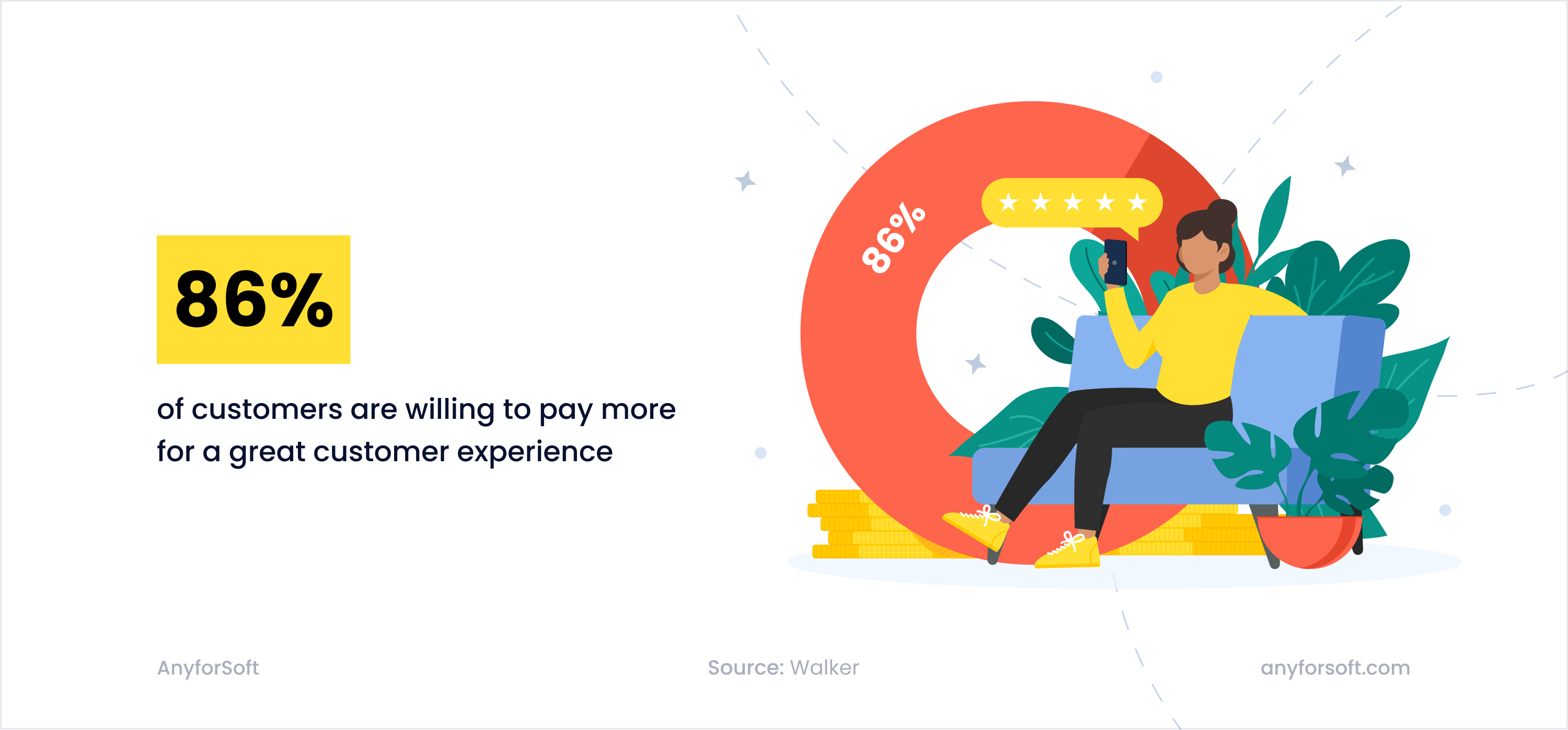
86% of consumers are willing to pay more for a great experience. That’s why we included the customer-first approach on our list of digital media industry trends for 2024.
This trend will never lose its importance and will remain a driving force for the entire digital media and entertainment industry. However, with the growth and development of technology, it is no longer enough to just be where the clients are, i.e., follow them to their phones, tablets, and other devices. The high competition encourages the creation of a unique and exciting experience for clients that would keep users as long as possible.
This approach includes not only new marketing strategies, perks, and bonuses to subscribers of streaming services and channels, but also the use of emerging technologies. Quite frankly, users expect innovation. According to Salesforce, 69% of customers believe companies should offer new ways to get existing products and services, and 54% believe they should offer entirely new products and services.
PwC’s Consumer Intelligence Series found that customers are willing to pay up to 16% more for a superior experience, and that 65% of customers consider a positive brand experience more influential than great advertising.
Focusing on the younger generation of consumers, many companies have already begun to implement VR (virtual reality) and AR (augmented reality) technologies and thus completely transform the experience. However, a wider audience reach strategy allows for greater profits and is more promising in the long term. Interactivity to User Journey can be also added with special website or application options. For example, animation of processes, adding gamification (with integrated advertising), and similar functions are still very popular and sometimes more relevant for certain digital media businesses.
Analytical Tools Implementation
New trends in digital media appear every month, but what always remains the same is the importance of data analytics. It’s not just a way to get better—it’s practically a guiding star. The opinion of your customers influences everything: from content creation to the placement of advertisements and the choice of promotion methods. Therefore, it is imperative to adopt the required set of analytical tools. These can be:
- Built-in plugins
- Third-party applications
- Software tools (paid and free)
- Custom-developed tracking systems to meet the needs of a digital media company
Analytical tools collect, sort, and classify information, simplifying the work with large amounts of data. By analyzing it, you can better understand what your visitors expect from you, optimize your site accordingly, and thus improve conversion rates as well as customer satisfaction.
Consumers know that the more information you collect about them, the more customized the experience they will get, and this applies not only to recommendations but also to advertising. However, everyone is concerned about the safety of personal data, so you should choose only reliable solutions for collecting and analyzing data. And, of course, take care of the security of your platform.
Chatbots
Among other technology trends in media and entertainment, we can’t fail to notice the fact that chatbots are becoming more and more sophisticated. It can be explained easily—given the value chatbots bring to the entertainment and media industry and other industries, more companies invest in developing them.
But how exactly do chatbots help?
Let us demonstrate it with a real-life example—the chatbot of the Harry Rosen store.
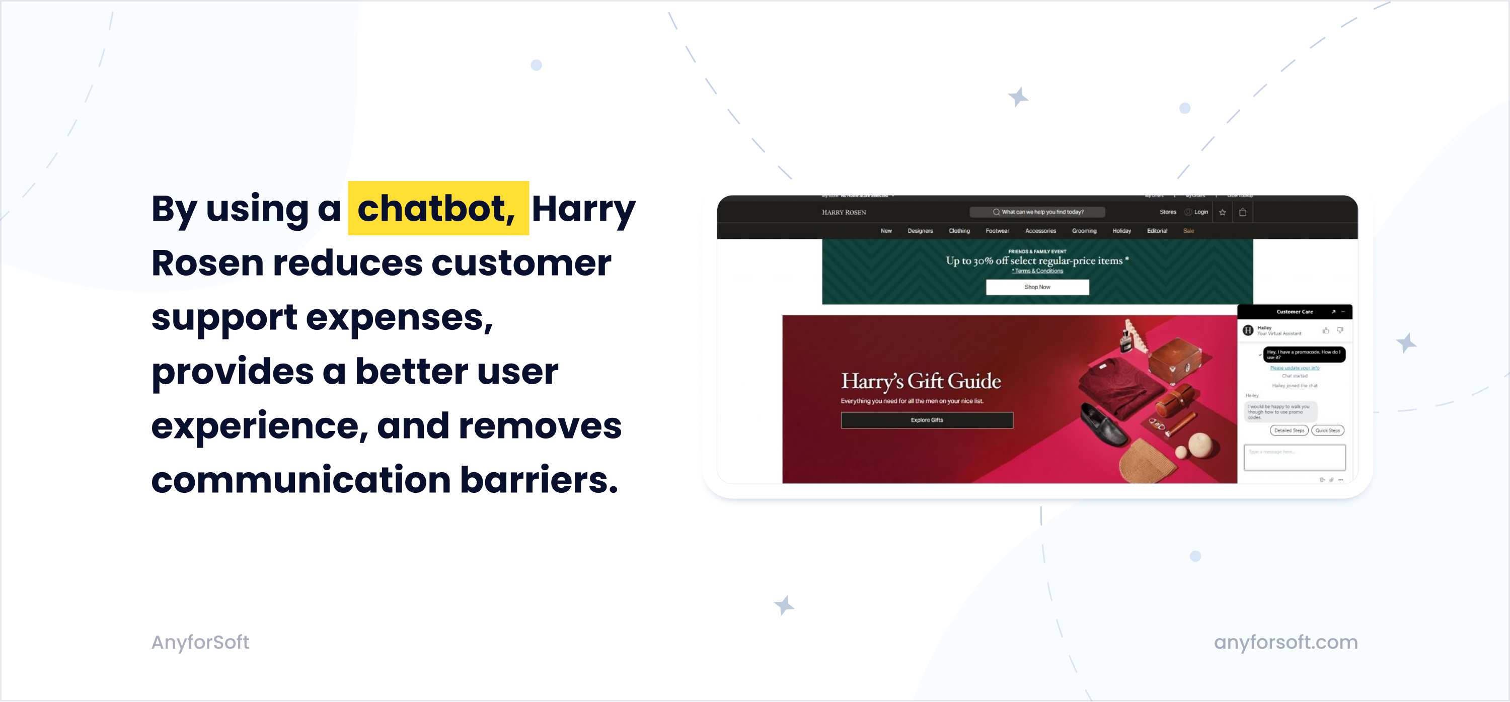
The chatbot benefits the Harry Rosen store in three ways:
- Lower customer service expenses. Instead of hiring a customer support specialist who would help visitors via chat, the store uses an AI-powered system that can handle the same task for no cost.
- Better user experience. Thanks to a chatbot, a Harry Rosen visitor can get an answer in less than five seconds (no human can reply that fast).
- Lastly, the chatbot removes communication barriers. Shy people are often afraid to speak to a real customer support manager. However, with virtual assistants, the fear is completely eliminated. Potentially, this could lead to more sales.
That’s why chatbots are among the current trends in the media and entertainment industry.
According to Grand View Research, the global chatbot market reached $11.8 billion in 2026, up from $9.56 billion in 2025, and is projected to reach $27 billion by 2030. In retail specifically, Juniper Research projects chatbot spending to grow from $12 billion in 2023 to $72 billion by 2028.
That’s why you should definitely consider developing a chatbot for your business.
Paying with cryptocurrency
Speaking of trends in the media and entertainment industry, we couldn’t forget to mention cryptocurrency.
Crypto is an emerging trend in the media and entertainment industry. Today, many media platforms work with cryptocurrencies exclusively. Creators can share their music, writing, and photography via the network to earn rewards in crypto. It is hard to find a better sign of digitization: digital arts are paid for with digital money.
Both large and small entertainment channels along with the sharks of the media industry should add crypto to their payment options. It is true that cryptocurrencies are still far from being adopted globally. But they are evolving rapidly, and who knows which of the media industry trends will grab the attention of all crypto-friendly consumers in the future.
Influencer marketing
In recent years, influencer marketing has become one of the most prominent trends in the media industry. In 2016, the market size was only $1.7 billion US dollars, but since then it has grown to a whopping $14.27 billion! And guess what? The industry is expected to reach $143.10 billion by 2030.
With that said, we believe influencer marketing is currently one of the hottest trends in the media industry. More and more digital businesses and media organizations are paying influencers to promote their product and services, and so far this has proven to be effective. Some even claim that for every $1 invested, they get $5 profit.
We believe that it will continue to be this way. As a popular proverb goes “make hay while the sun shines.” Thus, in 2024 and the following years, we will definitely see more investments in influencer marketing.
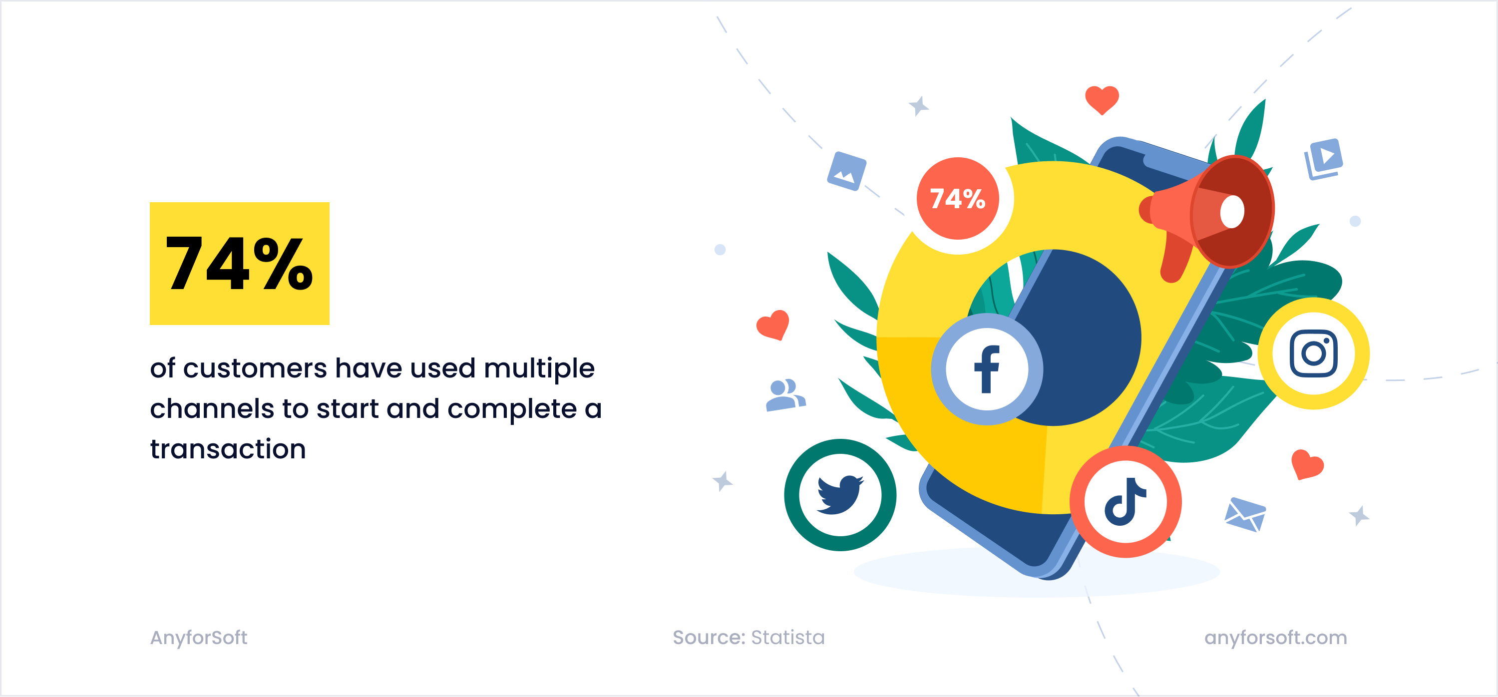
Multi-Channel Strategy
The engagement of a new audience is what pushes digital media and entertainment companies forward. And the surefire way to attract more customers is to be present in multiple channels. To follow the latest trends in the media sector, you should create accounts on these social media platforms:
- X (formerly Twitter)
- TikTok
Let us show you how it can help with a real use case.
Bon Appétit, a magazine of cooking recipes, demonstrates a 64% increase in subscription year after year. The recipe for success is quite simple: adaptation to the digital format and presence in multiple channels. Starting as an average print publisher for middle-aged adults in the 1950s, Bon Appétit has transformed itself into a multi-channel media enterprise 60 years later. Long videos on YouTube, short posts on Instagram, and diverse content on its website cater to younger consumers whose family experience might not include learning how to cook from their parents.
New digital processes are changing the way media is created and distributed. Usually, media businesses are focused on content creation and distribution optimization, but those companies that have already embarked on the digitalization path should focus on automating processes, launching new rights management systems, and building algorithms to help content creators streamline the process of creating content.
There are no critical hurdles for traditional businesses in the digital economy but it is worth finding an appropriate streaming entertainment technology to engage new subscribers.
Some may argue that every brand is available on the Internet today, and if so, there is no need in calling for a larger media presence. But the fact of the availability of a website as such does not make any content viral and any customer loyal. It was enough for the so-called dot-com era, but not for now.
Many companies find it difficult to create unique content for each social network, so it is difficult for them to maximize their web presence.
A bigger part of your consumer audience is abandoned if social media are not integrated. And the younger generations sidestep a brand whose YouTube channel does not follow all the recent entertainment trends. It is worth remembering that contemporary consumers spend 92 minutes a day watching videos.
A brand can make a memorable footprint in the digital economy only when a combination of the best media practices runs through advanced publishing software. AnyforSoft has significant experience in those software tools and techniques that help brands meet the toughest challenges of media. Drupal 9, React, dynamic content features, and social media integration constitute the stack with which happy customers of AnyforSoft invigorate their digital projects.
Video Streaming Services
One of the most prominent emerging trends is streaming video. On-demand streaming is transforming the global media landscape and impacting viewing behavior around the globe. Driven by rapid leaps in internet adoption, widespread availability of mobile devices, and the ever-increasing popularity of online video content (as well as the gaming industry), the streaming industry has experienced unprecedented growth in the last decade.
In 2025, global OTT video revenue reached over $340 billion, more than double the figure recorded just three years prior. All factors indicate that streaming platforms will continue to grow in popularity.
By the way, we have a useful article that explains how to create a video streaming website—check it out if you haven’t already.
Augmented Reality and Virtual Reality
Those interested in digital technologies shouldn’t sleep on augmented reality and virtual reality. These technologies offer a new way of digital transformation that media and entertainment businesses have never seen before. More specifically, they offer more immersive content and experiences:
- VR provides immersive experiences, transporting users to entirely virtual worlds. This is heavily used in the gaming industry, allowing players to step into the game environment.
- AR adds digital content (additional elements) to the real world, thus enhancing user experience. For instance, Snapchat and Instagram uses filters that customers can activate when using the camera. They add interactive overlays to their appearances, which makes these media companies and their platforms more fun to engage with.
Another reason to embrace this media and entertainment technology is that it offers enhanced storytelling. Media companies can use VR and AR to immerse users into their stories more effectively. In VR, users can become a part of the story, which ultimately leads to more immersive and emotionally engaging narratives.
AR can augment physical books, posters, and even real-life events with additional digital content, providing a more interactive storytelling experience.
AI Adoption
One of the most prominent media and entertainment trends in 2026 and beyond is arguably AI adoption. From gaming to video streaming, media companies rely heavily on artificial intelligence and machine learning to improve their digital products and deliver the best user experience.
The scale of adoption is significant: PwC’s Global AI Study found that 64% of media companies are already using AI in some form. On the production side, Deloitte reports that AI can reduce video editing time by up to 30%, while McKinsey’s 2025 analysis of film and TV production estimates that AI could influence approximately 20% of original content spend within five years.
Let’s take Netflix, for example. This digital platform leverages the power of AI technologies to offer personalized content recommendations to users.
When a user lands on the platform, its recommendations system helps them find a show or movie that they will likely enjoy. It estimates the likelihood that the user will watch a particular title in the catalog based on a number of factors:
- their interactions with Netflix (viewing history and how the user rated other titles on Netflix);
- the interaction of other members who have tastes and preferences similar to the user;
- information about the titles, such as their genre, categories, actors, release year, etc.
To optimize the user experience even further the platform also takes into account the time of day the user watches the content, the devices they’re using, how long they watch, and other signals.
With artificial intelligence, Netflix and other streaming services achieve near-perfect content personalization, making sure that viewers will spend more time watching.
Beyond recommendation engines, generative AI has become a production tool across the industry. Media companies now use it to assist with scriptwriting, generate synthetic voices and music, automate subtitle translation, and produce ad creative at scale. What was experimental in 2022 is now a standard part of post-production and content workflows.
Cloud Gaming
Speaking about current trends in the media and entertainment industry, we can’t fail to mention cloud gaming. Cloud gaming (or gaming-as-a-service) is a type of online gaming that utilizes remote servers hosted on the cloud to stream video games directly to users’ devices over the internet. It allows you to play your favorite games without having to install them on your computer. The best part, your computer hardware doesn’t matter—if your PC is older than dinosaurs, you can still run your favorite games in a high-quality resolution with cloud gaming.
Cloud gaming has gained lots of traction lately. And that’s totally understandable, as it offers plenty of benefits:
- Accessibility. Regardless of your hardware, you can access your favorite games. All you need is a good internet connection.
- Lower costs. Upgrading PC hardware is quite expensive. Cloud gaming allows you to play your favorite games even on outdated hardware.
- Convenience. Cloud gaming tech solutions enable you to access your favorite games without having to download and install them.
Statista projects the global cloud gaming market to reach $10.46 billion in 2025 and grow to $28.60 billion by 2030, a compound annual growth rate of 22.28%.
We believe that gaming-as-a-service will gain even more prominence in the near future, shaping the media and entertainment landscape.
Successful Digital Media and Entertainment Transformation Stories
The enhanced multimedia capabilities brought income-leveraging outcomes to the KharkivToday news portal when our developers took on the job of improving its website. Now it looks and works like a profound publisher software. Consumers have appreciated the innovations with 11% higher attendance and 14% longer time spent on the site.
Another case of improved publishing software is the biggest theater producer in Europe, Stage Entertainment. Their multi-million audience with diverse cultural backgrounds used to be spread over numerous local websites, which made the corporate management overcomplicated. Besides, entertainment productions and numerous shows require user-friendly UI/UX designs. A cohesive digital platform with a clear content hierarchy has resulted from the involvement of our team in the quest of enhancing the project.
Custom-designed content elements were rearranged with Drupal multisite and Acquia Cloud in such an efficient manner that selling tickets offline became redundant for Stage Entertainment. This is not about following fancy publishing trends; this is about the monetization of business in the tough era of lockdowns.
Emerging technology trends in the media and entertainment industry differ, entertaining approaches vary, but what remains unshakable is the necessity to enhance the media presence of every forward-looking brand. Since the future lies in the digital direction, the developers of the best publishing software are becoming indispensable ingredients of success these days. And AnyforSoft is here to help you explore how deep the rabbit hole of digital transformation is.
We hope you enjoyed this article.
If you are longing to start your own digital journey but need the help of professional developers to do it, don’t hesitate to contact us. We will build an experienced team that will create your product in accordance with your vision!
